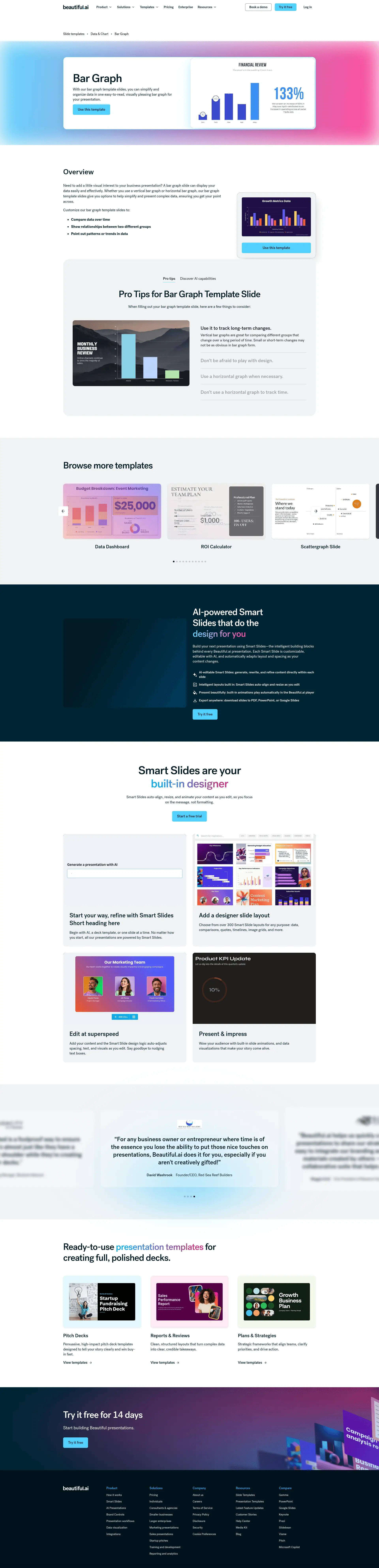
Two views of the same set of changes. Optimization Draft is the standard draft view, with the full before/after copy for every element in live page order and the paste-ready schema package. Annotated Before & After lays the same changes over a screenshot of the live page at beautiful.ai/templates/bar-graph, taken August 24; click a numbered marker to jump to its card. The full module spec behind every change is on the review hub.
| Page URL | https://www.beautiful.ai/templates/bar-graph |
| Category | Data & Chart (breadcrumb: Slide templates › Data & Chart › Bar Graph) |
| Head Term | bar graph template |
| GSC Baseline | #20.2 for “bar graph template” (90 days) |
| Proposed Title Tag | Bar Graph Template for Presentations | Beautiful.ai (51 chars) |
| Proposed Meta Description | Start from a designer-made bar graph template, add your data by hand or let AI fill it in, then take the finished slide to PowerPoint or Google Slides. (151 chars) |
| Summary | The live title misspells the brand as “Beutiful.ai” on top of the doubled suffix, and the page ranks #20.2 for “bar graph template.” The rewrite fixes the title defect, carries the head term through H1 and meta, and adds the template gallery, how-to, FAQ, and links modules. |
Why: The live H1 never says “template.” At #20.2 with the strongest sibling set in the batch, the head term belongs in the headline.
With our bar graph template slides, you can simplify and organize data in one easy-to-read, visually pleasing bar graph for your presentation.
A designer-made bar graph template that’s fully editable. Add your categories and values by hand or let AI fill them in, and Smart Slides keep the layout aligned as you edit.
Why: The live subhead repeats the meta description. The new one names what the template holds: categories, values, and the Smart Slides behavior that keeps the slide presentable while the data changes.
Use this template
Use this template (kept, primary) + Fill it in with AI (new, secondary)
Why: “Use this template” matches what the searcher came for and stays primary. AI fill is the differentiator no printable or vector template site on this results page can offer, which earns it the secondary slot.
A band of static previews of this template in multiple slide themes, each opening the editor. The existing walkthrough video keeps its tile in the band and still plays on click.
Why: The “bar graph template” results page is won by rich galleries of editable variants. This page shows a single graph behind a video embed.
Why: Canva and Venngage both walk the searcher from template to finished chart in numbered steps; none of the 236 Beautiful.ai pages does. Every step is a documented product behavior.
Why: The overview copy is real, useful content and stays. The heading becomes the question searchers actually ask, and the block moves down so the page leads with what the searcher came for: the template.
Need to add a little visual interest to your business presentation? A bar graph slide can display your data easily and effectively. Whether you use a vertical bar graph or horizontal bar graph, our bar graph template slides give you options to help simplify and present complex data, ensuring you get your point across.
Customize our bar graph template slides to:
Why: The overview copy is real, useful content and stays word for word; only the heading changes and the block moves below the new template layer.
“Pro tips” and “Discover AI capabilities” render inside a tab component; the second tab’s content sits behind a click.
Both blocks kept in full, laid out as stacked sections. Two copy edits from the grammar gate: “Discover AI capabilities for bar graph” → “for bar graphs,” and the tips heading “Pro Tips for Bar Graph Template Slide” → “Slides.”
Why: The AI block covers data summarization and trend detection, genuinely differentiated against chart-widget sites, but the tab hides it from crawlers.
When filling out your bar graph template slide, here are a few things to consider:
Use it to track long-term changes. Vertical bar graphs are great for comparing different groups that change over a long period of time. Small or short-term changes may not be as obvious in bar graph form.
Don’t be afraid to play with design. You can use one bar graph template slide to display a lot of information, as long as you differentiate between data sets. Use colors, spacing, and labels to make the differences obvious.
Use a horizontal graph when necessary. If your data labels are long, a horizontal bar graph may be easier to read and organize than a vertical bar graph.
Don’t use a horizontal graph to track time. A vertical bar graph makes more sense when graphing data over time, since the x-axis is usually read from left to right.
With these AI-driven features, you can optimize your bar graph in seconds to create more engaging, effective visuals.
Refine copy on a bar graph slide Leverage AI to edit text within a bar graph slide, no ChatGPT needed. AI can help create new text with a prompt, re-write existing text, and expand or shorten text length.
Summarize complex data sets Collaborate with the AI assistant to craft the perfect narrative. The technology can summarize complex data into more digestible chunks.
Find trends and relationships in the data Ask the AI to identify trends or relationships in the data to add as an annotation or call out.
Create a supporting image Tell the AI what you’re looking for and generate an image that complements your bar graph perfectly.
Why: Every tip and AI capability above ships unchanged; only the layout un-nests so the copy is visible without a click.
Twelve autoplaying Vimeo embeds from the Data & Chart category, Data Dashboard through Gantt Chart, including a Bar Graph card that links back to this very page.
Static image cards with descriptive text links, “Pie chart template,” “Line chart template,” “Waterfall chart template”, with videos still available on click, and the self-referencing card dropped.
Why: Twelve autoplaying embeds make this the heaviest carousel in the batch. Static cards with head-term anchors keep the breadth signal and cut the weight.
Is the bar graph template editable?
Yes. The template is a fully editable Smart Slide: change values, rename categories, switch between vertical and horizontal bars, and the layout adapts automatically as you work.
How do I add my own data?
Open the template and type your categories, values, and axis labels in, or upload a document or data file and Beautiful.ai places your data on the slide.
Can AI fill it in for me?
Yes. Describe the comparison you want to show, and the AI assistant fills the template with categories, values, and axis labels in place. You can keep editing everything afterward.
Can I export to PowerPoint or Google Slides?
Yes. Slides export to PowerPoint, Google Slides, or PDF, and you can also present or share a live link directly from Beautiful.ai.
When should I use a bar graph?
A bar graph works best for comparing data over time, showing relationships between two groups, or pointing out patterns and trends. Vertical and horizontal layouts both work; pick the one that keeps your category labels readable.
Why: The answers are product facts in this page’s own nouns, powering FAQPage schema (marker 3). No answer claims the template is free; the copy competes on design quality and AI fill.
“More data & chart templates”: every Data & Chart sibling linked with its head term as anchor text (Pie chart template · Line chart template · Donut chart template · Area chart template · Waterfall chart template · Gantt chart template …), plus the slide templates hub and the data visualization page.
Why: This is the same links module already specced on the pie chart page, seen from the other side: the Data & Chart cluster is the biggest in the library and currently crawls as disconnected pages.
The Smart Slides band, testimonials, template gallery band, and footer CTA below the carousel are site-wide template chrome, shared by every page on the site, and are unchanged.
| Title tag | carries the head term → carries the head term |
| Meta description | carries the head term → carries the head term |
| H1 | missing → carries the head term |
| How-to H2 + HowTo schema | missing → carries the head term |
| FAQ H2 + FAQPage schema | missing → carries the head term |
[
{
"@context": "https://schema.org",
"@type": "BreadcrumbList",
"itemListElement": [
{
"@type": "ListItem",
"position": 1,
"name": "Slide templates",
"item": "https://www.beautiful.ai/slide-templates"
},
{
"@type": "ListItem",
"position": 2,
"name": "Data & Chart"
},
{
"@type": "ListItem",
"position": 3,
"name": "Bar Graph Template",
"item": "https://www.beautiful.ai/templates/bar-graph"
}
]
},
{
"@context": "https://schema.org",
"@type": "HowTo",
"name": "How to use the bar graph template",
"step": [
{
"@type": "HowToStep",
"position": 1,
"name": "Open the template.",
"text": "“Use this template” opens it in the Beautiful.ai editor."
},
{
"@type": "HowToStep",
"position": 2,
"name": "Add your data.",
"text": "Type your categories, values, and axis labels in, upload a document or data file, or describe the comparison and let AI fill the template."
},
{
"@type": "HowToStep",
"position": 3,
"name": "Make it yours.",
"text": "Adjust colors and labels; Smart Slides keep the layout aligned as you edit."
},
{
"@type": "HowToStep",
"position": 4,
"name": "Present or export.",
"text": "Share a live link, present in Beautiful.ai, or export to PowerPoint, Google Slides, or PDF."
}
]
},
{
"@context": "https://schema.org",
"@type": "FAQPage",
"mainEntity": [
{
"@type": "Question",
"name": "Is the bar graph template editable?",
"acceptedAnswer": {
"@type": "Answer",
"text": "Yes. The template is a fully editable Smart Slide: change values, rename categories, switch between vertical and horizontal bars, and the layout adapts automatically as you work."
}
},
{
"@type": "Question",
"name": "How do I add my own data?",
"acceptedAnswer": {
"@type": "Answer",
"text": "Open the template and type your categories, values, and axis labels in, or upload a document or data file and Beautiful.ai places your data on the slide."
}
},
{
"@type": "Question",
"name": "Can AI fill it in for me?",
"acceptedAnswer": {
"@type": "Answer",
"text": "Yes. Describe the comparison you want to show, and the AI assistant fills the template with categories, values, and axis labels in place. You can keep editing everything afterward."
}
},
{
"@type": "Question",
"name": "Can I export to PowerPoint or Google Slides?",
"acceptedAnswer": {
"@type": "Answer",
"text": "Yes. Slides export to PowerPoint, Google Slides, or PDF, and you can also present or share a live link directly from Beautiful.ai."
}
},
{
"@type": "Question",
"name": "When should I use a bar graph?",
"acceptedAnswer": {
"@type": "Answer",
"text": "A bar graph works best for comparing data over time, showing relationships between two groups, or pointing out patterns and trends. Vertical and horizontal layouts both work; pick the one that keeps your category labels readable."
}
}
]
},
{
"@context": "https://schema.org",
"@type": "VideoObject",
"name": "Bar Graph slide template - Beautiful.ai",
"description": "Walkthrough of the bar graph template Smart Slide in Beautiful.ai.",
"embedUrl": "https://player.vimeo.com/video/397022325"
}
]Why: All four blocks generate from the same per-page content slots, so they scale mechanically across all 236 pages. The existing schema block’s url host gets aligned to www.beautiful.ai. The VideoObject covers the kept hero video; its thumbnailUrl comes from the client’s own video-indexing pipeline, which owns poster assets.